Graphical confidence intervals for a linear regression in Google Sheets
For a brief period of time Google Sheets had a Statistics add-in which generated graphs of regressions lines and 95% confidence intervals for the regression line graphically.
The graph above provided a visual approach to whether a slope could possibly be zero. A possible slope of zero would leave open the possibility of no relationship between the variables. The Statistics add-on was credited to "Google Developers" and was eventually removed as an add-in. Google lost a number of capabilities with this deletion, including boxplots.

The LINEST array function available in Google Sheets since 2016, when configured to do so, will provide the information necessary to calculate the 95% confidence interval for the slope and the intercept. This provides a numeric answer to whether a slope could be zero, is more precise than a chart, and yet is less visually satisfying.
The above analysis show that a slope of zero is possible and that the negative slope is not necessarily significant. The slope could be zero or even positive. Note too that the t-statistic for the slope does not exceed t-critical and the p-value exceeds 0.05.
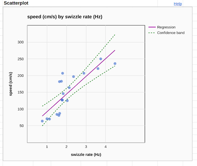
 The above chart was produced using Google Sheets without any add-ins and provides essentially the same information visually. The chart utilized a formula for the standard error of the estimate of the mean value at a given x value. My thanks to Glen_b for that formula. Note that I do not know if my approach is correct or not, nor whether I have used the formula correctly. I remain concerned that I found I had to use σy in the calculation of the standard errors. A first attempt using σx produced an meaninglessly large interval that did not make sense.
The chart was customized to not show the data points used for the confidence interval nor for the confidence interval bounds. Under the hood the spreadsheet is calculating the y-values for the linear regression and the linear regression 95% confidence interval bounds for each x-value that has a data point. The linear regression line is being generated by a linear fit to the linear regression data points, the confidence interval bounds for the regression are being fit with a polynomial fit.
 The data points that are generating the lines can be seen in the chart above. The polynomial curve well fits the upper and lower bound points.
While I am unable to show that the calculations in the spreadsheet are correct, the result appears to concur with the LINEST function results, showing that a slope of zero or even a slightly positive slope is possible based on the data.
Thus I can show graphically that my time to run to the river and back is not decreasing with the passing of the years, the negative slope is not statistically significant. Slopes of zero or slightly positive are also supported by the data at a 95% level of confidence.
Post-script: Note that the correct fit for the upper and lower bounds should probably be some sort of hyperbolic construction with the regression as the midline. This is not an option in Google Sheets and the parabolic regression used to generate a pseudo-fit is highly problematic below x-minimum and above x-maximum. Too, the scaling of the axes can be misleading. Even with those two caveats, there appear to be potential problems with the algorithm being used to generate the upper and lower bound points, the curve does not seem to narrow enough for mathematically perfect regressions. The lines provide only some visual guidance, a way to visualize the uncertainty in the fit, and do not always concur with the p-value from the LINEST analysis.

The graph above provided a visual approach to whether a slope could possibly be zero. A possible slope of zero would leave open the possibility of no relationship between the variables. The Statistics add-on was credited to "Google Developers" and was eventually removed as an add-in. Google lost a number of capabilities with this deletion, including boxplots.

The LINEST array function available in Google Sheets since 2016, when configured to do so, will provide the information necessary to calculate the 95% confidence interval for the slope and the intercept. This provides a numeric answer to whether a slope could be zero, is more precise than a chart, and yet is less visually satisfying.
The above analysis show that a slope of zero is possible and that the negative slope is not necessarily significant. The slope could be zero or even positive. Note too that the t-statistic for the slope does not exceed t-critical and the p-value exceeds 0.05.

The chart was customized to not show the data points used for the confidence interval nor for the confidence interval bounds. Under the hood the spreadsheet is calculating the y-values for the linear regression and the linear regression 95% confidence interval bounds for each x-value that has a data point. The linear regression line is being generated by a linear fit to the linear regression data points, the confidence interval bounds for the regression are being fit with a polynomial fit.

While I am unable to show that the calculations in the spreadsheet are correct, the result appears to concur with the LINEST function results, showing that a slope of zero or even a slightly positive slope is possible based on the data.
Thus I can show graphically that my time to run to the river and back is not decreasing with the passing of the years, the negative slope is not statistically significant. Slopes of zero or slightly positive are also supported by the data at a 95% level of confidence.
Post-script: Note that the correct fit for the upper and lower bounds should probably be some sort of hyperbolic construction with the regression as the midline. This is not an option in Google Sheets and the parabolic regression used to generate a pseudo-fit is highly problematic below x-minimum and above x-maximum. Too, the scaling of the axes can be misleading. Even with those two caveats, there appear to be potential problems with the algorithm being used to generate the upper and lower bound points, the curve does not seem to narrow enough for mathematically perfect regressions. The lines provide only some visual guidance, a way to visualize the uncertainty in the fit, and do not always concur with the p-value from the LINEST analysis.


Comments
Post a Comment