Posts

Showing posts from July, 2021

From Canvas outcome results to R to flexdashboard

Image
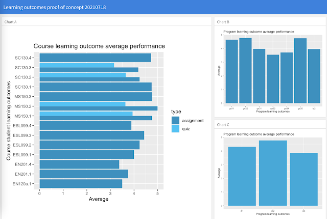
A week ago I began a journey to explore the admin outcomes report from Instructure Canvas. I began by struggling my way through to a chart , learned to select, mutate, and join with dplyr, and then connected two dimension tables separated by a main data table where each dimension table had a different primary key. This last step took me beyond where Google Data Studio can go at present - Data Studio must have a common key across all joined tables.  Today I took the results from the week and built a static dashboard of some of the results using flexdashboard. The code driving the dashboard was cleaned up including dropping comments and simplifying by some up front ETL work on the underlying tables, including the removal of a number of variables. The only error today was forgetting that to build the web page one has to issue an rmarkdown render command, rmarkdown::render("outcomes_20210718.Rmd") This week also included my own first foray into watching videos to learn a new s

Canvas and R outcome results join to SIS and aggregating outcome dimensions

Image
One of the reasons for working in Google Data Studio is that Data Studio is free. The most crippling limitation is that all tables must share a common key. This is a problem for the Canvas outcome results analysis. The learning outcome names (clso in my R code below) are aggregated by a dimension table with program and institutional learning outcome mappings. The only connection back to a student information system dimension table, however, is via IDNumber. Data Studio dashboards can display either performances aggregated by course, program, and institutional learning outcomes, or performances aggregated by course learning outcomes and SIS variables. Data Studio cannot report SIS variables against program or institutional learning outcomes. Such as gender versus program learning outcomes (pslos). One could pre-process to build a single massive union table and dump that into Data Studio, but if one has software that does that already, what would be the point of using Data Studio? Obviou

Summer session 2021 week seven analytics

Image
Systemwide metrics Week seven brought closure to the regular summer term. A few courses for new freshman which started a couple weeks behind the regular summer term remain in session. Of note this week was the appearance for the first time of course learning outcomes from the institutional bank of course learning outcomes in Canvas from courses other than my own MS 150 Statistics and SC 130 Physical Science courses. The above dashboard was explored in a video . Another  video  explains how to add these institutionally stored course learning outcomes to any college course in Canvas. This dashboard, along with others that have been produced, remain proof of concept explorations. The design and the metrics reported can be specified by the college. The data powering the dashboard is actual data from those courses. Trends by category in Canvas remained consistent with the trends seen over the past four weeks.  The surprise this week was a spike in page views on Monday. Monday of week seven

Instructure Canvas outcome results R dplyr select mutate left_join

Image
This is a second day of looking at using R to explore the Instructure Canvas admin outcome results file. In my earlier exploration I tackled using group_by and ggplot to display student learning outcome averages by course level learning outcomes. My intent in a second day of work was to perform some extract, transform, and load (ETL) operations up front on the actual CSV export file from Canvas, rename their space punctuated variables, rescale the outcome scores to all be on a five point scale, join the table to a dimension table on a left outer join, and then generate essentially the same graph as I had generated earlier.  Canvas exports tidy data in the outcome results file which makes possible the use of readr and dplyr from the tidyverse package. That the data is tidy apparently saves weeks of potential cleaning work . Beyond basic file loading and ggplot work, the following code uses dplyr select to both select and rename eight of the thirty variables in the original CSV ex

Canvas mobile sending messages to students who have not submitted

Image
The Instructure Canvas mobile app has many powerful capabilities tucked away. One feature that might not be obvious is the ability to message students who have not submitted an assignment, among other messaging options. This option is also available in the desktop from the grades, there the feature is accessed from a vertical ellipsis menu. On mobile the feature is perhaps a little less obvious. Access the assignment on the app for which you want to message the students. Tap on the lower right arrow seen above to see the submissions. The submissions screen shows All Submissions. Note the filter in the upper right. Tap on the filter.  The filter has a number of options. Here I have selected the Not Submitted option in order to send a reminder to those who have not yet submitted. I can now see only those who haven't submitted yet. In the bottom right hand corner of the screen is an envelope icon. Tap that to launch a message to the filtered students. To remove a particular student f

R and RStudio first days

Image
Work I have been doing in DataStudio and a recent article on PowerBI, Tableau, and Shiny, caused me to take another look at R and RStudio . As an instructor of statistics I am more than keenly aware that R is the go to tool for statistics and data exploration. This is not my first foray into R, but this time the journey is driven by work to explore producing student learning outcome dashboards.  The student learning outcomes data is tidy data and that makes use of the Tidyverse package possible. Still, the journey is far more challenging than a spreadsheet or business intelligence dashboard. Even once I have a working line of code, there are pieces of the code line that I simply do not understand. This is something I am accustomed to when tackling software, but some of the more baffling aspects do not seem to be explained and do not resolve themselves in my mind once they are working. I am more used to languages that once the code is working, I can then see why the code is working.

Tech survey on a small convenience sample

Image
A tech survey was deployed in the online MS 150 Statistics course summer session 2021. Of 25 students only 12 responded.  The green row has no particular meaning other than it is the first row. The survey suggests upwards of 75% of the students are accessing the Internet from home. A significant portion of the student are using either ADSL or the newer Kaboom fiber optic connectivity. Cell phones remain the dominant technology in the hands of these few students. Although perhaps two thirds of the students own a cell phone, only a quarter of the students are doing their classwork on a cell phone. Note that this sample may be particularly biased in that the survey was delivered using Instructure Canvas' survey capabilities. All 12 respondents were using Canvas to respond. Canvas is particularly "mobile friendly" permitting both instructors and students to accomplish more in the Canvas app than was possible in the Schoology app. 

Summer session 2021 week six analytics

Image
Systemwide platform metrics for courses in Canvas After wrapping up a laboratory, a number of students would often remain to work on their laboratory report in the classroom. This was not something that was seen during regular fully residential terms in the past. Week six of the summer 2021 term saw modest increases in the number of assignments, discussions, files, and media recordings.  The number of students dropped by five students, marking a third consecutive week of small decreases in the number of students. As a proxy for engagement, page views showed a second week of reduced week-on-week pages views for each day of the week versus the first four weeks of the term. Page views are incurred whenever a student loads a new page in Canvas. While some of decrease in page views may reflect increasingly efficient access to materials by students, there are hints that there may be some disengagement occurring late in the summer term. Teasing out whether the students are more efficient or w

Physci Canvas, affective domain, and laboratory survey

Image
All nine students registered in  SC 130 Physical Science  at term end summer session 2021 completed a written anonymous survey. Because submission rates for online surveys can be low, this survey was done in class at the end of a residential laboratory class.  This summer was a second term for the Instructure Canvas pilot. The students were asked "What did you like about Canvas?" The student comments were overwhelmingly positive. Although this sort of survey is usually a Likert style survey, an open written response can provide more detail and texture than a "strongly like/like/dislike/strongly dislike" survey. Easy accessing Everything. The way it is set was very convenient for as a student Helpful I like Canvas because it gives me details on everything that I need to learn and have to learn in Physical Science. I like Canvas because it makes things easier I like it because it is built to make teaching and learning easier for everyone, from the littlest learners to

Site swap mathematics

Image
This summer I opted not to open with a video but to launch directly into site swap notation.  This term I began on an RL rather than LR labelling as I tend to launch first from my right hand. I had arrived early and had the 3 and 51 diagrams on the board at class start. I asked the students to predict the next letters and colored circles. I showed that the numbers were the count of spaces. I then showed that switching a blue and green circle changes the order from RGB to RBG. I actually put in two swaps to show the RGB order could be restored. Shrue used a two ball dapadap to get into a three ball juggle Nicole also used dapadap to get into a three ball juggle From there I drew parallels to the way mathematics is taught: in the abstract. I noted that we had been doing mathematics all term long. And yet we had solved only a couple equations. There are other faces to mathematics, other approaches to quantitative literacy that I would argue are no less valid than the memorization of pre-b

Physci exploration: hula hoop rotation rates

Image
Laboratory 14 is a lab practical. The students are given a system where the relationship between the variables is not something available on Google. This term my intent was to have the students look for a relationship between hula hoop diameter and the "natural" rotation rate for the hoop. Unfortunately I could not locate any hoops on island, let along the five different diameters I knew I would need to generate sufficient data points. Lacking any clear idea what might work, would be affordable, and relatively easy to work with, I settled on pipe insulation. This would prove suboptimal being too light to hoop properly. Equipment included stopwatches, duck tape, meters sticks, a tape measure, a snap knife, and marbles. The marbles could fit in the tubes, but they rolled, so they could not be spaced out to provide a balanced hoop. The marbles were abandoned, but then the hoops were too light. Pipe insulation details. Six insulation tubes each six feet long were used to make hoo