Canvas and R outcome results join to SIS and aggregating outcome dimensions
One of the reasons for working in Google Data Studio is that Data Studio is free. The most crippling limitation is that all tables must share a common key. This is a problem for the Canvas outcome results analysis. The learning outcome names (clso in my R code below) are aggregated by a dimension table with program and institutional learning outcome mappings. The only connection back to a student information system dimension table, however, is via IDNumber. Data Studio dashboards can display either performances aggregated by course, program, and institutional learning outcomes, or performances aggregated by course learning outcomes and SIS variables. Data Studio cannot report SIS variables against program or institutional learning outcomes. Such as gender versus program learning outcomes (pslos). One could pre-process to build a single massive union table and dump that into Data Studio, but if one has software that does that already, what would be the point of using Data Studio?
Obviously PowerBI and Tableau are solution sets to the above issue, but neither are free. Besides, I have been meaning to learn a little R. In the past I really did not have data to work with that needed anything more than a spreadsheet. My typical dataset has been ten to thirty rows of classroom data, a couple dozen columns of assignments and tests. Not the stuff one turns to R to crunch.
The pilot test of Instructure Canvas has also included looking at reporting of course learning outcomes from an institutional bank of outcomes. Data from just a couple classes ran to 3000 rows with 30 variables. This summer roughly 180 courses are being offered on six campuses, during a regular term the number is larger. Row counts in the hundreds of thousands are possible for the main outcome results table, not including SIS and other tables.
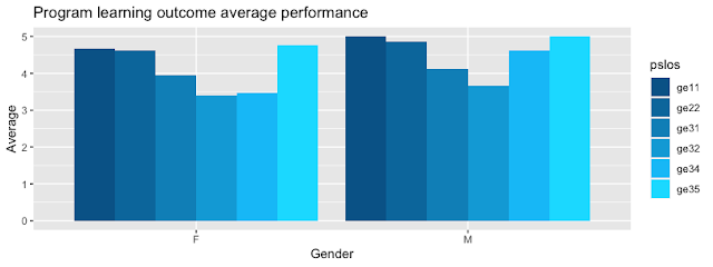
Over the past few days I stumbled my way to a couple charts. First to a chart from the single main table of learning outcomes in the outcomes results table. Then joining an outcome dimensions table to generate learning outcome results that can be aggregated against program and institutional learning outcomes. This evening involved adding only three more lines of code to be able to do what Data Studio cannot: generate aggregated results by a SIS variable in the SIS dimension table against a variable in the program and institutional learning outcomes dimension table, using the main outcome results table only as a linkage between the dimension tables.
And, yes, I used HCL color names, which I know better as HSL from the world of CSS3, to generate a monocolor tone sequence. HSL rules, RGB drools. Always. The chart has some deficiencies, but nothing that some makeup and lighting cannot fix.library(tidyverse)
outcomes <- read_csv("outcome_results_csv_02_Jul_2021_13020210702-16780-19vemtl.csv")
# Load a custom prepared dimension file unique primary key IDNumber
outcome_dimensions <- read_csv("outcome_dimensions.csv")
sis_dimensions <- read_csv("sis_dimensions.csv")
ungroup(outcomes) # Outcomes may be grouped from prior work. Remove as appropriate
# select 8 of the 30 columns and rename variables to remove need for back ticks
# capitalization of IDNumber is driven by a SIS variable
outcomes <- outcomes %>% select(IDNumber = `student sis id`,
type = `assessment type`,
cslo = `learning outcome name`,
score = `outcome score`,
course = `course name`,
term =`course sis id`,
section =`section name`,
possible = `learning outcome points possible`)
outcomes <- mutate(outcomes, pentascale = 5 * score / possible) # rescale on five point scale
# Hello SQL: left join the dimension tables the dump back into outcomes
outcomes <- outcomes %>% left_join(outcome_dimensions, by = "cslo")
outcomes <- outcomes %>% left_join(sis_dimensions, by = "IDNumber")
# The following chart cannot be done in Data Studio because
# Gender is primary key in sis_dimensions and cslo is primary
# key in outcome_dimensions. Data Studio requires a common
# key in all tables.
outcomes %>% group_by(pslos, Gender) %>% summarize(avg_score = mean(pentascale, na.rm = TRUE)) %>%
ggplot() +
geom_bar(mapping = aes(x = Gender, y = avg_score, fill = pslos), stat = "identity", position=position_dodge()) +
labs(title="Program learning outcome average performance", x="Gender", y = "Average") +
scale_fill_manual(values=c(hcl(220,100,30),hcl(220,100,40),hcl(220,100,50),hcl(220,100,60),hcl(220,100,70),hcl(220,100,80)))


Comments
Post a Comment