Posts

Showing posts from January, 2022

Day five acceleration

Image
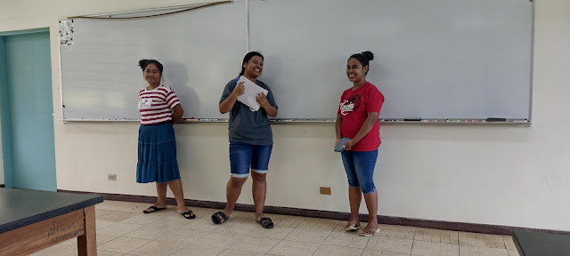
On the fifth day of acceleration the students shared their findings from the previous session's exploration. Groups were assured that even if they did not find an equation, that was alright. Renay, Bethyanne, and Rose Anne used the equation y = ax²+bx+c in Desmos and sliders for a, b, and c to determine the coefficients. Saya and Adelina made a calculation for the location of the vertex. Their vertex was, somewhat coincidentally, located at almost twice the distance to the roots.  Blossom, Donnalynn, Leipolanda, and Darla used the vertex form of a quadratic to obtain the correct coefficients.  Cyron and Richard explained that they had not worked through to an equation - which is alright in this exercise. This was an exploratory exercise, an approach to mathematics that reveals the shortcomings of an all algorithmic based approach to algebra. The students cannot actually apply the information they have when asked to go from a graph to an equation. Note that the use of Desmos is enco

Cooling curves Arcminutes of longitude Clouds summer 2021

Image
Some imprudent bush whacking to retrieve banana leaves for laboratory four eventually led to tight lower back muscles that inveighed against doing swizzle frequency versus velocity for laboratory six. I returned to a cooling curve laboratory.  The session started with a review of the Celsius temperature scale and a demonstration of the remote surface temperature measuring device.  I began the laboratory portion with the open question of what happens to temperature over time for a cooling object? What mathematical model does cooling obey? Linear? Something else?  I then let the students discover the behavior. Melissa I had put on the board for the first column the time in minutes. I told the students to wait one minute before putting in the thermometer to prevent the melting thermometer problem. I noted that they would then need to wait one minute to take their first measurement at two minutes. Then they could take a measurement and three minutes, four minutes, five minutes. I meant one

Ratio level histograms in class

Image
Ratio level histograms were introduced by having the students measure their resting heart rate. The result was a sample of size n of nine resting heart rates in beats per minute: HR: 45, 50, 50, 51, 52, 55, 57, 60, 61  The minimum was 45, the maximum was 61. The range was 61-45 equals 16. The usual rule is to use the square root of the sample size to determine the number of classes. Classes are also known as intervals. Excel calls classes "bins" and Google Sheets calls classes "buckets." A sample size of nine would normally mean using three classes. To avoid working with fractions, I chose to use four classes each four heartbeats wide (16 ÷ 4 classes = a class width of 4): 45-49, 50-53, 54-57, 57-61.  There was one heart rate between 45 and 49, four between 50 and 53, two between 54 and 57, and two between 58 and 61. This can be turned into a frequency histogram that looks something like: Note that the chart is only displaying class upper limits. Google Sheets can a

Canvas analytics week three spring 2022

Image
The number of courses and instructors on the Instructure Canvas platform increased slightly in week three.  The percentage share of assignments, discussions, and media recordings is on par with week three of fall 2021 .  As also seen last fall, page views - which are a proxy for engagement on the platform - dropped after the first two weeks. This is thought to be due in part to faculty engaging in term start course set up work during the first two weeks. Daily page view patterns are consistent with the patterns seen during the fall term 2021. Page views peak during on weekdays with Monday or Thursday seeing peak page views. Friday sees a slight drop in page views. Saturday sees the least engagement, with engagement rising into Sunday evening. 

Day four acceleration and the arc of a ball

Image
 I opened day four by taking the students back through the graphs for the first three days.  I took care to point out that all week we had examined time versus distance. I emphasized that on day four we would be looking at space versus space, horizontal versus vertical. I demonstrated a ball arc in front of the board and asked the shape the ball's path would trace out. One student suggested a circle. Another suggested a parabola. I then had the students, working in pairs, trace ball arcs on the board. Six groups were up at the board.  Three pairs on the right, three on the left.  Jasmine working on her ball arc with Jessie May.  After the students had sketched their arcs, I added in an x-axis. Splitting the distance between the x-intercepts in half, I wrote the coordinates of the x-intercepts. I also measured the height of the vertex above the x-axis, with all measurements being done in centimeters using a meter stick.  A circle as being the shape was ruled out by the shapes seen o

Favorite color exercise in statistics and nominal level histograms

Image
MS 150 Statistics class on nominal histograms began with 14 students. I handed out slips of blank paper to the students and asked them to write down their favorite color.  Upon collecting the slips there were five blue, five black, two green, one gray, and one aqua. I wrote these down in a column on the whiteboard in order as color words. I noted that the sample size n was 14. I asked the class what was the level of measurement. One student suggested that the level was nominal, which is correct. This is qualitative, discrete, nominal level data. The data are the color words.  I then asked what the mode was for the data. The students saw the tie between blue and black, which is confusing. I explained that there is no mode - there is no one single data value that occurs more frequently. The data is, in some sense, bimodal: there are two modes, blue and black. A student entered and as she walked in I asked her what her favorite color is. She replied, "Gray." Shortly thereafter a