Student evaluation preliminary overall results fall 2022
Students in courses at the college anonymously submitted responses to a student evaluation survey. Students were instructed to fill out the survey once for each course they were in. The data below derives from 736 surveys.

Submissions per day
Although evaluations can still be submitted by students, there is potential benefit in having a look at thees numbers prior to the winter break. This allows instructional coordinators to provide support and guidance to instructors well ahead of the spring 2023 term.

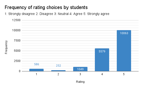
The distribution of scores indicates the preponderance of items marked "Strongly agree." Students not only tend to mark a score five at almost twice the rate of choosing a four, students often mark only fives for all metrics.


Of those 43.6% of the students who chose the same number for every metric, the most common choice was to mark all fives. 231 students marked a straight five for all metrics. Sixteen students marked one for all metrics - they strongly disagree with every statement. While this may have been their intent, there is also the possibility that they were not reading the evaluation and marked the first column just to be done with the task.


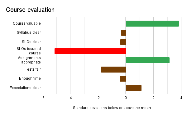
Although the difference in the values between valuable learning experience, effective assignments, and expections is small, only the first two appear to be significantly above the mean for this section.


Overall running average evaluation score after November 29
Students tend to Agree (4) or Strongly agree (5) across almost all metrics. This is why the overall running average settles to a value near 4.4 out of 5 possible. With metrics phrases such that higher values are better results, the high average would suggest that overall the instructors, courses, and course materials are well received by the students.

Frequency of rating choices by students

Standard deviation of student responses (note that underlying data is interval level data)
A look at the standard deviations in the scores for each individual student reveals that 43.6% marked the same value for every single metric. In a sense, the students voted a "straight ticket," they marked the same value for every metric. When students did mark another metric, they rarely venture more than one away from the "straight ticket." This suggests that even a difference of one, for example between a four and five, is a difference that should be paid attention to. Students rarely mark a score two or more away from their average score - only 3.0% of the students marked across a wider range of values.

Zero standard deviation choices: all responses the same
The students who chose a mixture of fours and fives were making intentional decisions, and thus a four can be seen as a down rating on a given metric. Small differences in the averages may have real meaning in terms of areas of relative strength and weakness. Highlighting these differences with a conditional formatting is done in the tables pictured in the sections below.
In the charts the sections below, the horizontal access is essentially a form of a t-statistic. The value is the number of standard errors of the mean above or below the overall mean for that average in that particular section. Areas of strength are denoted by green bars and extend above positive two standard errors on the right. Areas of relative weakness are denoted by red bars and extend below negative two standard errors on the left. Brown bars are areas close to the mean for that section of the survey.
Instructor evaluation
- Overall, this instructor was effective
- The instructor presented the course content clearly
- The instructor emphasized the major points and concept
- The instructor was always well prepared
- The instructor made sure that the students were aware of the Student Learning Outcomes (SLOs) for the course
- The instructor gave clear directions and explained activities or assignments that emphasized the course SLOs
- The instructor initiated regular contact with the student through discussions, review sessions, feedback on assignments, and/or emails
- The instructor presented data and information fairly and objectively, distinguishing between personal beliefs and professionally accepted views
- The instructor demonstrated thorough knowledge of the subject
- I received feedback on assignments/quizzes/exams in time to prepare for the next assignment/quiz/exam

The first metric, "Overall, this instructor was effective" was the lowest rating in this section of the evaluation. This leaves one wondering where the weakness is because no other metric is rated that low.

Instructor evaluation
Areas that were rated unusually low in spring 2022, "Timely feedback" and "Regular contact" are now not significantly depressed below the overall mean for the section.
The students still down rate "The instructor presented data and information fairly and objectively, distinguishing between personal beliefs and professionally accepted views."
This leaves unanswered what instructors might work on improving to be perceived as being effective.
Faculty received high marks for being prepared and communicating student learning outcomes.
Course evaluation
- Overall, this course was a valuable learning experience
- The course syllabus was clear and complete
- The student learning outcomes were clear
- The SLOs helped me focus in this course
- Assignments, quizzes, and exams allowed me to demonstrate my knowledge and skills
- The testing and evaluation procedures were fair
- There was enough time to finish assignments
- Expectations were clearly stated

Courses are perceived as being a valuable learning experience with assignments that allowed students to demonstrate their knowledge and skills. Expectations were clearly stated.

Course evaluation
The area of most significant weakness was "The SLOs helped me focus in this course." Instructors "gave clear directions and explained activities or assignments that emphasized the course SLOs" but students did not find that this helped them focus in the course. Understanding that disjunction might be better addressed by focus groups, this survey provides no clear insight into why this split has occurred. Among other questions to be asked would be what the students interpret by statement, "The SLOs helped me focus in this course."
Course materials evaluation
- Course materials were relevant and useful
- The textbook for this course was appropriate to the course content
- I was easily able to access the textbook for this course
- The assigned readings were relevant and useful
- The on-line resources were relevant and useful
- The course learning management system (Canvas) was satisfactory.
- If the course had videos, the videos were relevant and useful

In the course materials section the highest average was for the metric, "The course learning management system (Canvas) was satisfactory."

Course materials evaluation
The weakest metric was "I was easily able to access the textbook for this course" which was significantly below the mean for this section. This was also the lowest metric on the survey across all three sections. This suggests this the area of greatest relative weakness.
A new question on the evaluation allows this metric to be parsed by online, hybrid, and residential courses. Hybrid refers to classes such as some of the science classes where the lecture is online while the laboratory is residential.

Although the differences are small, small differences still reflect choices being made by the students. The lowest average for this metric is for the online courses. Students in online courses are not as easily able to access the textbook for a course as are the hybrid and residential students. This may also be a reflection of a lack of alignment: if a course is online, then the textbook should also be online.

Student's course: residential, online, or hybrid?
For reference, about half of the students who submitted an evaluation are in online courses. Roughly a quarter of the respondents each are in hybrid and residential courses.
Learning materials preferences

Learning materials preferences
When asked what learning materials students prefer, in class lecture was the dominant response. The number of students preferring in class lectures exceeds the number of residential and hybrid students, thus this must include online students.

Across all three modes students prefer in class lectures. This suggests that while online courses provide increased access, students still prefer the residential class experience.

Teachers, course, and students (10s) by subaccount in Canvas
At present the online subaccount in Canvas has the highest enrollment, but in general the students would likely prefer more residential classroom experiences when and where possible. The evaluation suggests that the balance of courses might not well reflect the desires of the students. The data suggests that the college is offering too many courses online and should be offering more residential courses.
To some extent this may also reflect a broader global trend: employees who have learned to work at home are reticent to return to the workplace. At present instructors tend to have the lead on deciding whether to offer a class online or residentially. While the college should and will continue to offer online options for students, there may need to be decisions made on rebalancing the online to residential ratio while continuing to meet the needs of students who benefit from online courses.
The data in the above chart also provides an opportunity to look at student to teacher ratios by campus.

Student to teacher ratios
Bear in mind the student to teacher ratios do not reflect the average class size. This is why the national campus has a student to teacher ratio that exceeds the residential cap of 18 per section. This is an overall measure and reflects load on faculty not average class size. These ratios only reflect students in courses that are actively using Canvas. These ratios do not include unpublished courses. Some of the unpublished courses are active residential courses, but others are courses that were canceled, transferred to another faculty member, or are unpublished for other valid reasons. Canvas data cannot determine the reason a course has been left unpublished.
Source of evaluations by campus

Source of evaluations by physical campus

Submission ratio by physical campus
If one divides the number of students at a physical campus by the number of students in the Canvas subaccount for that campus, one gets a rough estimate of a submission ratio. This ratio can exceed one because the online campus is not a physical campus. The evaluations for online courses appear in the campus to which the student is physically registered. A CTEC student who is taking only online courses would not appear in the CTEC subaccount student count, but their evaluations credit back to the CTEC campus.

Although difficult to quantify, CTEC appears to have a larger relative population of online students versus the other campuses. This provides support for CTEC building out online student support capabilities such as sheltered, accessible study areas with high speed connectivity, possibly increased computer laboratory access or space. The high submission rate at national campus may also reflect significant support for online students operating from the national campus.
If high ratios suggest an excess of online students operating from a campus, a low ratio may indicate a reduced number of online students operating from a campus. Again, the data is not directly translatable to online participation rates, that would require a deep data dive into the student information system. This data is only suggestive of online participation.
The above chart suggests Kosrae has the lowest participation rate in online courses. This makes sense as Kosrae is the only island without a fiber optic cable link to the Internet. Kosrae's connectivity is negatively impacted by weather. The location of the island is also problematic due to a paucity of overhead satellites that far east. The result is that Kosrae's satellite connections are always a suboptimal angle. Valiant efforts are made to overcome the many challenges of keeping Kosrae campus connected to the Internet with a bandwidth sufficient to meet demand, but the connectivity problems for Kosrae only get worse once a student leaves the campus. Connectivity for students in rural Malem are often too limited to load web pages or apps. Oddly enough, even when web pages and Canvas would not load, YouTube videos would still be accessible in rural Piyuul, Malem. The last three apps to lose connectivity were the YouTube app, Meta (Facebook) Messenger app, and the Gmail app (not the desktop version). Those were the last three tools standing before all loss of connectivity. This led to the recommendation that videos produced for courses are best made available to students via YouTube.
Mean evaluation score by two letter course prefix

Average score by two letter course prefix
The table above provides the mean score by two letter course prefix. Note that data cleaning has not yet occurred. These should be treated as estimated values. The underlying samples sizes are sufficient to make this calculation. Data cleaning includes correcting incorrect prefixes or where a student has omitted the two letter course prefix and entered only the course number. That work is more labor intensive and will not occur until the winter break.
All errors in the above report are solely those of that author. Any opinions expressed are solely those of the author.


Comments
Post a Comment