RipStik Logistic Curve for algebra and trigonometry class
In chapter five, section five, of the Larson Algebra and Trigonometry text book the author introduces mathematical models. Summer provides a 90 minute period, which affords some space to experiment within.
In the past I had used the speed versus distance along a track for a 100 meter sprinter to demonstrate a logistic model, yet this remained abstract. I do not know why I had thought of it before, but I realized that if accelerated at a constant rate for a short distance and then held a constant speed, the velocity data should mimic that of a sprinter. A brief constant rise in velocity to a top end velocity.
This generates the "upper half" of a logistic curve. I went outside and used seven stopwatches in the hands of seven students to time at 100, 200, 400, 600, 800, 1200, and 1600 centimeters. Accuracy could have been improved by a single stopwatch held by me doing the timing, but that would distract me from the steady acceleration to cruise. The spacing was designed to capture the 400 centimeter acceleration I planned to do, followed by a long cruise phase.
Sidewalk marks were still in place from earlier physical science runs, I only added the 100 and 200 cm marks. I ensured the stopwatches were all in split mode this time, and had the students test their watches. Data was captured in a single run, the RipStik started from a standstill.

The first table developed suggested that something went wrong for the timer at 200 cm as the speed over the segment 100 to 200 cm was 244 cm/s, far faster that I was going at that point. I also apparently slowed down over the final 400 cm, that data point was also removed. That happened over the flat as I prepared to dismount. A small amount of board swizzle should offset that, plus running out past the 1600 mark.
Graphing the data against a custom tweaked logistic equation produces the following graph.
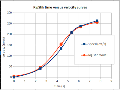
I was surprised by the "S" shape. Sprinters only generate the "upper half" of the logistic. I suspect the lower half is potentially spurious and not necessarily real. That said, an instructor has to run with what nature and the students have produced, in this case a more characteristically logistic curve than I expected.
Taking the data to be valid, the slope of the curve is the acceleration. I did not share this with the class as the point was to generate a logistic model, not to analyze the meaning of the curve. That the slope changes indicates a varying acceleration. I suppose the only way to ascertain whether there is an initially low acceleration phase will be to run this again at some future time.
In the past I had used the speed versus distance along a track for a 100 meter sprinter to demonstrate a logistic model, yet this remained abstract. I do not know why I had thought of it before, but I realized that if accelerated at a constant rate for a short distance and then held a constant speed, the velocity data should mimic that of a sprinter. A brief constant rise in velocity to a top end velocity.
This generates the "upper half" of a logistic curve. I went outside and used seven stopwatches in the hands of seven students to time at 100, 200, 400, 600, 800, 1200, and 1600 centimeters. Accuracy could have been improved by a single stopwatch held by me doing the timing, but that would distract me from the steady acceleration to cruise. The spacing was designed to capture the 400 centimeter acceleration I planned to do, followed by a long cruise phase.
Sidewalk marks were still in place from earlier physical science runs, I only added the 100 and 200 cm marks. I ensured the stopwatches were all in split mode this time, and had the students test their watches. Data was captured in a single run, the RipStik started from a standstill.

The first table developed suggested that something went wrong for the timer at 200 cm as the speed over the segment 100 to 200 cm was 244 cm/s, far faster that I was going at that point. I also apparently slowed down over the final 400 cm, that data point was also removed. That happened over the flat as I prepared to dismount. A small amount of board swizzle should offset that, plus running out past the 1600 mark.
| time (s) | speed (cm/s) | logistic model |
| 0 | 0 | 5 |
| 2.44 | 41 | 46 |
| 4.35 | 133 | 154 |
| 5.31 | 208 | 207 |
| 6.15 | 238 | 236 |
| 7.67 | 263 | 256 |
Graphing the data against a custom tweaked logistic equation produces the following graph.

I was surprised by the "S" shape. Sprinters only generate the "upper half" of the logistic. I suspect the lower half is potentially spurious and not necessarily real. That said, an instructor has to run with what nature and the students have produced, in this case a more characteristically logistic curve than I expected.
Taking the data to be valid, the slope of the curve is the acceleration. I did not share this with the class as the point was to generate a logistic model, not to analyze the meaning of the curve. That the slope changes indicates a varying acceleration. I suppose the only way to ascertain whether there is an initially low acceleration phase will be to run this again at some future time.


Comments
Post a Comment