Summer session 2021 week six analytics
Systemwide platform metrics for courses in Canvas
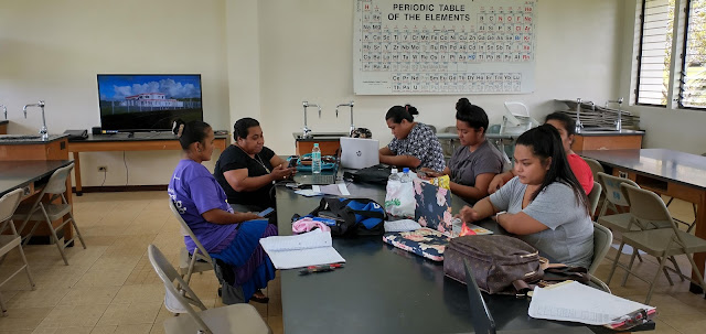
After wrapping up a laboratory, a number of students would often remain to work on their laboratory report in the classroom. This was not something that was seen during regular fully residential terms in the past.
Week six of the summer 2021 term saw modest increases in the number of assignments, discussions, files, and media recordings.
The number of students dropped by five students, marking a third consecutive week of small decreases in the number of students.
As a proxy for engagement, page views showed a second week of reduced week-on-week pages views for each day of the week versus the first four weeks of the term. Page views are incurred whenever a student loads a new page in Canvas.The complication is that page views are not performance in a course. In the only fully online course for which I have access to the data, my MS 150 Statistics course, the correlation between page views and performance is moderate (linear correlation r = 0.47, logarithmic correlation r = 0.62). Note that all faculty have access to this data for their own courses under the third "tab" marked Students in New Analytics.
While the correlation is moderate in MS 150 Statistics, there are some broad brushstroke observations that can be made. No student with less than 300 page views at the end of week six is passing the course. One could argue that less than 50 page views per week defines a disengaged student. No student with more than 650 page views is below 70% in the course. Between 300 and 650 page views performance cannot be predicted from page views. MS 150 Statistics and SC 130 Physical Science metrics
Week six saw the grade distribution patterns seen in MS 150 Statistics and SC 130 Physical Science remain almost the same as the prior two weeks.
The MS 150 grade distribution remains deeply bimodal, while the SC 130 distribution no longer has any students failing the course.
The MS 150 grade distribution provides more information on the distribution of the students who are achieving below 60% in the course. The one student in the 50s can likely still succeed in the course. The two in the 40s also could potentially recover. Students below 40 are broadly and deeply deficient in their mastery of the student learning outcomes. There is little likelihood of their recovering at this point.
Although submissions are still coming in for assignments 10.2, 10.3, test six, 11.1, 11.2, and the sixth data exploration on the right side of the chart, there are still hints of disengagement in the slightly lower submission rates after midterm. This suggests that disengagement is part of the explanation for the drop in page views.
Earlier this week an affective domain survey of student insights included a survey of student reactions to Canvas in SC 130 Physical Science. One of the findings was that all of the students in the course reacted positively to using Canvas. Both students and faculty have reacted positively to Canvas.
Follow-up on College of the Marshall Islands visiting team report recommendation
Last week I referenced a recommendation made to a regional institution by a visiting accreditation team. The team had recommended that the institution be able to disaggregate learning outcomes by subpopulations other than gender. I thought I could see parallel concerns here to those at the other institution, but there is always a risk of seeing what one wants to see. A risk of being unaware that one is misconstruing the nature and intent of a recommendation. I had no way of being certain that my approach of using Canvas and business intelligence software was addressing the recommendation.
Separate from the recommendation, I have also been concerned that I might be on the wrong track with my assessment system. Although my work has been based on a Kansas State University's office of assessment video presentation of an assessment workshop, the workshop videos focused more on the overall structure of the assessment system than on specific technical details on how to implement their system. And while internally some of my colleagues have reacted positively to my explorations, I have had no external validation of my work.
I reached out to the other institution sharing an explanation of my explorations. The response I got was that I was understanding the nature of their recommendation, my approach to a response was appropriate, and that I am on the right track in my work. This has given me more confidence in the work I have done. That said, my work remains exploratory in nature. There would be significant work to be done including migrating faculty to Canvas, training faculty to set up rubrics with outcomes from the institutional bank of course learning outcomes, learning outcome mapping decisions, impacts on outlines, setting up procedures, revising impacted reports, and transitioning smoothly from current assessment systems.


Comments
Post a Comment