Summer session 2021 week five analytics and learning outcomes
Systemwide platform metrics for courses in Canvas
Week five saw increases in the number of assignments, discussions, files, and media recordings. The increases were modest and indicative of the term starting to wrap up. The number of students dropped slightly again - the last day to withdraw from courses was at the end of this week.


One other new metric in this week's report is this average number of page views by day across all five weeks. This chart suggests peak engagement with the platform is on Thursdays, with lowest engagement on Saturdays. Academic student support on the platform is least needed on Saturdays.
Page views are a rough proxy for engagement and are only moderately correlated to course level performance. Data on page views versus performance in a course was examined last week.
 MS 150 Statistics continues to have a deeply bimodal grade distribution while SC 130 Physical Science is characterized by broad success in the course. Working one-on-one in person with the SC 130 students has proven effective will all but one student and performances there are improving. MS 150 Statistics has been more challenging and time will run out this term before effective interventions are likely to be found.
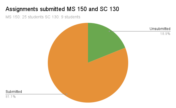
 Submission rates are up +9% from 72% at the end of week four to 81% at the end of week five. Across both courses 568 assignments of 700 total assignments made have been submitted.
  Submissions in MS 150 Statistics climbed from 74% to 83% with some students clearly doing catch up work during week five. The course is asynchronous and some students are working a few days behind others, hence the rise in submissions from the far right side moving towards the left. The numbers on the x-axis are regular homework assignments. T refers to tests. ODX refers to open data explorations that are submitted as presentations, they are the more challenging assignments of the course. Data explorations were added to the almost ten years ago as a result of the American Statistical Association Guidelines for Assessment and Instruction in Statistics Education (GAISE) recommendations made in 2005 and revised in 2016.
 In SC 130 Physical Science one student chose to withdraw from the course. The student cited low grades, there were also potentially child care factors involved. There are challenges for young women with pre-school age children to attend and succeed in college. Every few years discussions arise around offering child drop off day care for students. A variety of factors including logistics, budget, and cultural factors seem to prevent implementation. Submissions rates in physical science are up 11% from 60% to 71% and a number of students are catching up on back work.
MS 150 and SC 130 metrics
Week five saw the grade distribution patterns seen in MS 150 Statistics and SC 130 Physical Science hold the same as was seen at the end of week four.

As noted last week, at this point the online statistics course is a moderately mature online course in its fourth term online, supported by 76 videos and an online textbook which is also now available from within Canvas. The coursework and tests have been refined and adapted to online delivery over the past year. The support is there for students to succeed. My own impression from talking to students who have struggled in the class during the past year is that not all students have a learning style that adapts well to online education. For some students residential instruction is critical to their ability to succeed in college.


Learning outcomes reports for MS 150 and SC 130
Canvas provides the ability to export course learning outcome performance data. The course learning outcomes are being evaluated by rubrics attached to assignments that contain the course learning outcomes as criteria and by quizzes that include questions that are linked to course learning outcomes. Each course learning outcome maps to a general education program learning outcome each of which in turn then maps to an institutional learning outcome - both the current eight outcomes and proposed slate of five institutional learning outcomes.

Dashboard showing aggregated performance for program and institutional learning outcomes
The data is being displayed using a Google Data Studio dashboard. Data can be updated at any time, currently data is being updated weekly during the term. Current assessment systems in use provide only post hoc, after the term is over, assessment of learning. Canvas provides the capability for near real time data produced from actual course artifacts: rubrics used to mark assignments and test/quiz questions.
To date 2,388 artifacts are underneath these assessment dashboards. Each artifact is a learning outcome as a criteria on a rubric or a question in a test or quiz.
College of the Marshall Islands visiting team report recommendation
As part of their bid for reaffirmation of accreditation the College of the Marshall Islands (CMI) has received their Peer Review Team Report. The report represents the findings of a peer review team that conducted a virtual visit to College of the Marshall Islands in March 2021. The accrediting commission acted on the status of the institution during a June 2021 meeting which released the report in conjunction with an action letter to the college.
On page six the visiting team made the following recommendation:
Recommendation 2: In order to increase effectiveness, the team recommends that the College expand disaggregation in the collection and analysis of data on outcomes and achievement to better represent the diverse subpopulations of students. (Standard I.B.6)
Video on possible path for addressing the recommendation using Canvas
Page 25 and page 26 of the team report make clear that CMI is also using Nuventive Improve software for assessment.
A couple lines in the body of the report caught my attention. One was, "The college SLO Report includes a comprehensive assessment of SLOs, including assessment type and tool, benchmarks, and data assessment and analysis." on page 25.
Canvas provides information on the source of the assessment in the course including information on the assessment type and tool. This is not necessarily currently recorded in the present TracDat system. Current use of TracDat only records student learning accomplishment against a specified means of assessment, which does not directly report the actual source of the assessment. Data is at the level of how many students accomplished a particular outcome - a binary yes or no assessment.
The other line that caught my attention was on pages 19 and 20: "The Team observed that CMI disaggregates data on student learning outcomes and student achievement based on gender. As the College continues to learn and implement strategies for improvement to support all students from the main Majuro campus as well as other satellite campuses, it may consider other student attributes such as disability status. The disaggregation of outcomes and analysis will help identify performance gaps among the diverse student population. (I.B.5, I.B.6)."
This caught my attention because gender is also the only student metric being captured in the Nuventive Improve instance in use here, and this is being captured post hoc by having faculty manually enter data after the term is over. This has provided useful assessment data to the college, but further disaggregation is not possible in Nuventive Improve. Not without faculty manually entering, after the term is over, all possible combinations of disaggregation.
Canvas, however, can be used to analyze learning by any dimension available in the college student information system because the original data is generated directly out of marked assignments in the learning management system. And this happens with no additional effort by faculty beyond their regular coursework marking load, during the term, not after.

As mentioned in the video, the above dashboard view shows learning outcome data displayed primarily by major and cross-tabulated by state of origin listed by the student. Selectable list controls filter learning outcomes by course learning outcomes, course, source tool, and gender. Any other variable being tracked in the student information system could also be included in this analysis or included as a data filter.
There are three key take aways to the Canvas driven Data Studio dashboards:
- As an instructor I am doing no additional work. The data is being generated from daily marking of assignments and from online quizzes and tests.
- The data is available on demand, essentially in real time, during the term, not just after the term. I can respond to learning deficits during the term and use assessment data not just to improve the course but to improve learning for students in the course during the current term.
- The data can be analyzed not just by gender but by any variable in the student information system.
None of these three are true for the current system. Data entry is additional work. Data entry is done after the term has ended. No real time analysis during the term is possible with the current system. And data can only be analyzed by course and gender, with aggregation possible only to program and institutional learning outcomes. Disaggregation by non-gender variables is not possible.
Limitations on Nuventive Improve
Nuventive presented to the college in February 2019 on additional modules that could be purchased on a subscription basis but noted integration was not possible with Schoology. When I asked what platform Nuventive best integrated to, Nuventive responded, "Canvas," which is what started me on exploring Canvas.
A working group then had a look at our Nuventive instance and noted that there were potentially both configuration and data entry issues to be resolved going forward. The capabilities in Canvas suggest another path may be available for instructional assessment.
The following screen from an Analytics module impressed me in the Nuventive presentation of February 2019.

In March 2021 an assessment workshop video series from Kansas State University helped me understand that the above is simply a business intelligence dashboard on top of the Nuventive Improve data. The dashboard cannot provide any deeper insight than that which is available in the underlying data. I realized that Nuventive Improve could not disaggregate our data across other variables. With no linkage back to in-class artifacts, there is no path back to student information system variables.
Canvas is producing learning outcomes from in-class artifacts such as assignment rubrics and assessments such as questions on a quizzes and tests. Canvas generates data that can be used to drive interactive dashboards. Dashboards that faculty can use to discuss and dialog on assessment, data that generates new questions that can be asked in order to improve learning. Data that when linked to the student information system can be disaggregated by any variables in the student information system while still providing aggregated performance data on program and institutional learning outcomes.
With Nuventive Improve, Nuventive builds the dashboards and holds the data. If the college wants to reconfigure a dashboard, track a new variable, or build a new dashboard, that is done by Nuventive. Perhaps with fees incurred. This loss of control over assessment data concerned me even at that time.
The Data Studio dashboards are built and controlled by the college, not a third party. When it comes to instructional learning assessment, I would prefer control to be in house. Real time data available during a term requiring no additional work of faculty beyond using the course learning outcomes stored in the college bank of outcomes in rubrics or question banks. Learning outcomes results that can be disaggregated by any variable in the student information system.


Comments
Post a Comment