From Canvas outcome results to R to flexdashboard
A week ago I began a journey to explore the admin outcomes report from Instructure Canvas. I began by struggling my way through to a chart, learned to select, mutate, and join with dplyr, and then connected two dimension tables separated by a main data table where each dimension table had a different primary key. This last step took me beyond where Google Data Studio can go at present - Data Studio must have a common key across all joined tables.
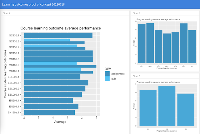
Today I took the results from the week and built a static dashboard of some of the results using flexdashboard. The code driving the dashboard was cleaned up including dropping comments and simplifying by some up front ETL work on the underlying tables, including the removal of a number of variables. The only error today was forgetting that to build the web page one has to issue an rmarkdown render command, rmarkdown::render("outcomes_20210718.Rmd")
This week also included my own first foray into watching videos to learn a new skill set. I grew up in the age of written guides and books - pre-Internet. I still turn to written guides and resources, only now they are online. For my R exploration this week I followed the leading learning choice of my students, videos. I found that videos were helpful both in my getting to see the process and because the videos more often show errors made. Books and online guides are cleaned up to show one what works, errors are not usually committed, corrected, and then left that was in a guide. But in a video I can see the errors that even capable users commit. And I learned from their errors, primarily learning where to start looking for the cause of my own errors in RStudio - the tools that tell you what went wrong and why. So this was new for a member of the generation that actually used a punchcard machine to write FORTRAN line by line on a punchcard.
I can also see why students prefer videos to live Zoom lectures and webinars. Many times I would back up a video and rewatch a segment, freeze a frame to have a closer look at the code. Sure, most instructors save their Zoom lecture as a video, but those files are often massive and unwieldy, often requiring downloading the whole way-too-long lecture. Why watch 50 minutes of a head shot lecture when there are excellent ten minute videos with graphics or code to show you how to do something? My profession are dinosaurs that do not understand their time is up. No, not this year, not next year. The dinosaurs did not disappear overnight contrary to popular meteorite memes - they were in trouble before the extinction event occurred. They just didn't know it. Just as punchcards are a relic of the past, so too are the ways in which school has operated over the past few centuries. But it may be another century before the old ways vanish.
library(readr)
library(ggplot2)
library(dplyr)
library(flexdashboard)
outcomes <- read_csv("outcome_results_20210718.csv")
outcome_dimensions <- read_csv("outcome_dimensions.csv")
outcomes <- mutate(outcomes, pentascale = 5 * score / possible)
outcomes <- outcomes %>% left_join(outcome_dimensions, by = "cslos")
outcomes %>% group_by(type, cslos) %>% summarize(avg_score = mean(pentascale, na.rm = TRUE)) %>%
  ggplot() +
  geom_bar(mapping = aes(x = cslos, y = avg_score, fill = type), stat = "identity", position=position_dodge()) +
  labs(title="Course learning outcome average performance",  x="Course student learning outcomes",  y = "Average") +
  scale_fill_manual(values=c(hcl(220,100,50),hcl(220,100,70))) +
  coord_flip()
outcomes %>% group_by(pslos) %>% summarize(avg_score = mean(pentascale, na.rm = TRUE)) %>%
  ggplot() +
  geom_bar(mapping = aes(x = pslos, y = avg_score), stat = "identity", fill = hcl(220,100,50)) +
  labs(title="Program learning outcome average performance",  x="Program learning outcomes",  y = "Average")
outcomes %>% group_by(islo5) %>% summarize(avg_score = mean(pentascale, na.rm = TRUE)) %>%
  ggplot() +
  geom_bar(mapping = aes(x = islo5, y = avg_score), stat = "identity", fill = hcl(220,100,60)) +
  labs(title="Program learning outcome average performance",  x="Program learning outcomes",  y = "Average")


Comments
Post a Comment