Statistics week three: Charts and nominal level histograms
This term I preset a spreadsheet to introduce charts in chapter 3.1. The sheet included a table for the students to practice on, and practice they needed. CA 100 give short shrift to creating charts in spreadsheets. In addition, many students had not taken CA 100 yet.


.png)

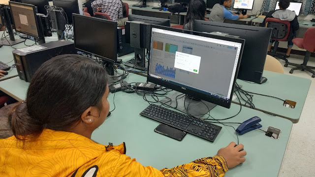
Here a student practices sorting the second column in descending order.
On Friday I went all in on blue including the use of blue post-it notes for the students to write their favorite color on. I went with blue over black on top of green with red underneath. I gave one student a list of the colors in order that I expected to see (two post-its, the top one covering my answers).

To say I failed is an understatement. Not only did black best blue this term, but a new color leapt into the top four, one that sits solidly down in seventh place on the all time list.

The results did allow coverage of the mode not being 1 but rather black. The sample size is the sum of the frequency data. Google Sheets pulled a new AI assist this term: In the relative frequency formula when I did a relative address fill down that yield division by zero, Sheets helpfully suggested that my formula needed to use an absolute address in the denominator. That caught be by surprise.

At least the demonstration lent itself to being a good example of being wrong. Green barely made the list this term.
.png)
Relative frequencies were also covered today. The all time chart means that I still have to run with blue over black. Blue over black holds 46% of the terms, black over blue holds 43%. The other 11% are blue-black ties. Thus blue over black is a statistical tie with black over blue. There is a small edge to blue over multiple terms, so that is where I have to go with this exercise.
While white improved its position, white trails purple by 21 students overall. That is a large margin for a color to overcome.

My own color preferences are in the aquamarine, teal, cyan, turquoise range of colors.


Comments
Post a Comment